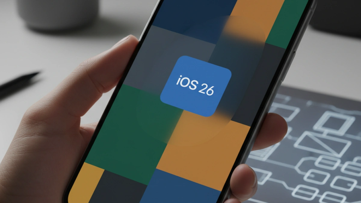
The release of iOS 26 has resulted in a significant redesign of the iPhone interface with its new style called Liquid Glass, which emphasizes the use of transparency. However, this aesthetic has not been to everyone's liking, as users have noticed that the legibility of certain elements is affected. Fortunately, there is a way to modify this appearance and recover a style more similar to the classic iOS. Here are some options to optimize the display on your device.
Disable Transparencies in iOS 26
As the saying goes, "to each their own." Some users may be happy with Liquid Glass, but it is undeniable that translucency affects the legibility of various components, making it harder to identify applications and causing menus and controls to overlap, which can be confusing. For those who prefer a clearer display, there is a helpful option to follow.
The button to activate is 'Reduce Transparency,' which does exactly what its name suggests by lessening this effect. To enable it, navigate to Settings > Accessibility > Display & Text Size and proceed to toggle the option off. By doing this, translucency is reduced, and the different elements on the screen become clearer and easier to distinguish.
Examples of Improvement in Display
The Photos app is a clear example where transparency can be detrimental. When viewing an image in full screen, the buttons become less discernible with the transparency option enabled. Additionally, when moving the picture, the background shifts, which can be disorienting for the user. On the other hand, the Control Center also benefits significantly from following this option, but the notifications panel shows a notable improvement. In this case, where information is presented in small text format, enabling 'Reduce Transparency' can facilitate reading by preventing everything from becoming distorted.
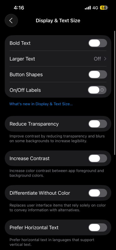
Moreover, if further readability improvement is desired, the 'Increase Contrast' option is available just below 'Reduce Transparency.' When this function is activated, the glare effect is minimized, making the elements appear flatter and more legible.
Design Options in System Apps
The redesign of iOS 26 also affects native applications such as Safari and Phone, which incorporate new interfaces. However, these applications offer the option to revert to the classic appearance.
Settings in Safari
When installing iOS 26, a compact layout in Safari is enabled by default, where the search bar is located at the bottom and features two buttons on either side. To customize the layout, one can go to Settings > Safari, where they can choose to keep the bar at the bottom without the compact design or revert to the traditional layout that places the address bar at the top.
Settings in Phone
In the Phone app, when opened, the option to try the new design is presented. Like in Safari, this interface is more compact, with fewer visible tabs at the bottom and the removal of the 'Calls/Missed' selector at the top. For those who prefer the previous interface, they can simply select the button located in the top right corner to return to the classic design.
Conclusion
For those who wish to enjoy a more traditional design on their devices with iOS 26 and avoid readability issues caused by transparencies, multiple adjustment options are available that can provide a more satisfying experience. From reducing transparency to customizing native applications, users have control over how they want their iPhone to be displayed.
If you want to learn more about how to enhance your digital experience, feel free to keep reading on my personal blog.