CSS Anchor Positioning and the Popover API: Tooltips and Menus Without JavaScript

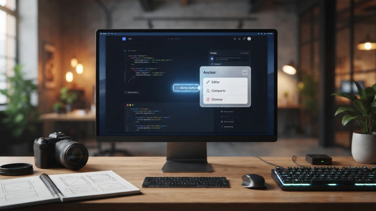
Placing a tooltip or a menu next to its trigger no longer requires measuring coordinates in JavaScript: CSS anchor positioning lets the browser place and flip the floating element, and the Popover API shows and dismisses it. Here is the full CSS, fallbacks and limits included.
The Problem We Have Always Lived With
Measuring With getBoundingClientRect and Recalculating on Every Scroll
An actions menu in a table, the help button of an admin panel, the tooltip on a toolbar: every floating element that hangs off another element used to be built the same way. First you measure the trigger's position with getBoundingClientRect(), then you write left and top onto the floating element, and then you recalculate on every scroll and every window resize. If the floating element is wider than the space left on screen, you fix it by hand.
Hand-Rolled z-index, Click-Outside Dismissal and the Menu That Overflow Cuts Off
On top of that come three small problems that repeat in every project: if a container has overflow: hidden, the menu shows up clipped; if there are stacked layers, you fight z-index until something lands on top; and dismissing on click-outside is one more listener to add and remove without leaking any. None of that is your product's logic: it is platform plumbing.
What the Browser Does for You in 2026
Two platform features cover most of that plumbing, and they do not overlap. The Popover API handles showing, hiding, managing focus and promoting the floating element to the top layer of the document. CSS anchor positioning handles where it appears relative to its trigger and what to do when it does not fit. On MDN, the Popover API is listed as Baseline 2025 and the anchoring properties —position-anchor, position-area, position-try-fallbacks, position-visibility, anchor-scope— as Baseline 2026. Baseline means the major engines ship it in their current versions; even so, check the compatibility table before you hang a critical component on one of them.
Read also


Step 1: Show and Hide With the Popover API
popover and popovertarget: a Dropdown Without a Single Line of JavaScript
<button type="button" popovertarget="actions-menu">Actions</button>

<div id="actions-menu" popover>
  <a href="/dashboard/edit">Edit</a>
  <a href="/dashboard/duplicate">Duplicate</a>
  <a href="/dashboard/delete">Delete</a>
</div>
The popover attribute turns the element into a non-modal floating layer and popovertarget points at its id: the browser toggles visible and hidden with no addEventListener from you. The element moves to the top layer, so your neighbours' z-index stops mattering, and its visible state is exposed through the :popover-open pseudo-class.
Light Dismiss, Focus and the Top Layer
The popover closes on click-outside and on Escape, the browser manages stacking order and returns focus to the right element when it closes. That is precisely the part almost nobody implements well by hand.
The Modes: auto, manual and hint
The attribute takes values with different behaviours. popover="auto" is the case described above: it closes on click-outside and closes other open auto popovers. popover="manual" does not close by itself and is used when the panel must stay put while the user clicks elsewhere. popover="hint" is meant for aids that should not take focus or interrupt the flow, such as a toolbar tooltip.

Step 2: Anchor the Floating Element to Its Trigger
anchor-name on the Trigger and position-anchor on the Floating Element
.trigger {
  anchor-name: --actions-button;
}

.menu {
  position: absolute;
  position-anchor: --actions-button;
  position-area: bottom span-right;
}
The anchor is declared with anchor-name on the reference element and consumed with position-anchor on the floating one. The name starts with two dashes, like a CSS variable, because that is exactly what it is: an identifier. If you remember older tutorials, position-area is the current name for what used to be inset-area.
position-area: Above, Below and to the Sides Without Math
position-area splits the space around the anchor into a nine-cell grid and accepts one or two keywords. bottom is equivalent to bottom span-all; bottom span-right places the floating element below and extends it to the right; top span-left mirrors that above. That covers the vast majority of cases without writing a single coordinate.
Fine-Tuning With anchor() and Sizing With anchor-size()
When you need to leave the grid, the anchor() function returns the position of one edge of the anchor and is used in inset properties: top: anchor(bottom) aligns the floating element's top edge with the trigger's bottom edge. anchor-size() does the same for size, for example width: anchor-size(width) so a menu measures exactly its button.
Step 3: Keep It On Screen
position-try-fallbacks: flip-block and flip-inline
.menu {
  position-try-fallbacks: flip-block, flip-inline;
}
The browser tries the positions in the list in order and keeps the first one where the floating element fits. flip-block flips the main axis —top instead of bottom— and flip-inline the cross axis, left instead of right. It is the same logic as collision libraries, resolved inside the rendering engine.
A Custom Fallback With @position-try
@position-try --top-corner {
  position-area: top span-right;
  margin-block-end: 0.5rem;
}

.menu {
  position-area: bottom span-right;
  position-try-fallbacks: --top-corner, flip-block;
}
The @position-try rule defines a named alternative, and position-try-fallbacks uses it like any other keyword. Do not mix up the three similar names: @position-try is the rule, position-try-fallbacks is the property holding the list, and position-try is the shorthand for ordering.
Hiding the Floating Element When Its Anchor Scrolls Away
If the anchor scrolls out of view, the floating element can stay stranded mid-screen. position-visibility: anchors-visible hides it once its anchor is no longer visible. The default is never to hide it, which is usually the wrong behaviour.
Step 4: Details That Break the Component When Forgotten
anchor-scope: Multiple Pairs Sharing a Name in the Same List
In a list of twenty rows, each row has its own button and menu. If they all share the same anchor-name, the browser has to resolve which anchor each position-anchor means. anchor-scope limits the reach of an anchor name to a subtree, so the name resolves inside the right row.
Enter Animation With @starting-style and transition-behavior: allow-discrete
.menu {
  opacity: 0;
  transform: translateY(-0.25rem);
  transition: opacity 150ms, transform 150ms, display 150ms allow-discrete;
}

.menu:popover-open {
  opacity: 1;
  transform: translateY(0);
}

@starting-style {
  .menu:popover-open {
    opacity: 0;
    transform: translateY(-0.25rem);
  }
}
A popover goes from display: none to visible, and a transition does not start from a state the browser never painted: that is what @starting-style solves. The allow-discrete keyword also lets you animate discrete properties such as display and overlay, which is what stops the panel from vanishing abruptly on close. It is the same technique we used when animating page changes with the View Transitions API.
The Minimal HTML Structure That Avoids Problems
Trigger and panel as siblings, both inside the same row or card container, with the panel on position: absolute. Avoid nesting the floating element inside anything with overflow: hidden: even though the top layer paints it on top, the container's clipping still affects what lives inside.
When You Still Need JavaScript
An Anchor That Changes Per Item: the Shared Tooltip Case
The classic case is a single tooltip moving across a long list: there is one floating element and the anchor must change depending on the row under the pointer. There you must update position-anchor from JavaScript, because CSS cannot guess which item is active.
Arrow-Key Navigation and Menu Roles
The browser manages popover focus, but it does not turn your list of links into a menu you can walk with arrow keys. If the component is a menu, add role="menu" to the panel and role="menuitem" to each option, and keep the keyboard handling. Replacing an accessible dropdown with an inaccessible one is not an upgrade.
What You Can Delete Today
Coordinate math, the z-index fight, click-outside dismissal and repositioning when the floating element leaves the screen all disappear wherever the API is supported. That means less of your own JavaScript and, often, one fewer dependency. If you work with utility classes rather than plain CSS, check what your Tailwind version ships before assuming you need arbitrary values: what we published on Tailwind CSS 4.3 is a good reference.
Support and a Safety Net
What Being Baseline Means and How to Verify It Before Relying On It
Baseline is not a decorative badge: it means the feature is interoperable across the major engines. The anchoring properties are Baseline 2026 and the Popover API is Baseline 2025, according to MDN, but check the compatibility table on the day you write the component, especially if your audience runs slow-updating browsers or if you depend on @position-try.
Feature Detection With @supports, Not User-Agent Sniffing
@supports (anchor-name: --x) {
  .trigger { anchor-name: --actions-button; }
  .menu { position-anchor: --actions-button; position-area: bottom span-right; }
}
The right question is about the capability you need, not the browser's brand. Unsupported CSS is ignored without errors, so the safety net is a fallback that works without the API.
The Fallback for Older Browsers
With a wrapper on position: relative, the floating element on position: absolute and a couple of top and left values, you get a decent menu wherever the API is missing. It is not the same experience, but the content stays usable and the component does not break.
Checklist Before You Ship
Keyboard, Focus and Screen Readers
Open and close the floating element with the keyboard alone, check that focus enters and leaves where it should, that Escape closes it, and that a screen reader announces the panel and its options. If the component is a menu, the checklist from our WCAG 2.2 AA accessibility audit applies as is.
Common Mistakes: No Fallback, Repeated Anchor Names and Out-of-Scope Anchors
The three most common failures: forgetting the fallback for browsers without support; repeating the same anchor name across several pairs without scoping it with anchor-scope; and anchoring to an element outside the floating element's scope — the anchor must be visible and share context, not live in another DOM branch hidden with display: none.
Conclusion
CSS anchor positioning and the Popover API do not kill every library, but they do take over the most tedious work: placing, flipping, stacking and dismissing. In the typical case —a menu hanging off a button and a tooltip that must not leave the screen— the component ends up as CSS plus HTML attributes, and JavaScript is reserved for what the platform still does not solve. Start with your simplest component, measure how much code you delete and decide from there; and if you want to keep polishing the front end without dependencies, the blog has more CSS tutorials with concrete cases.