How to Create Custom Borders with CSS: Borders with Images, Gradients, and Shapes


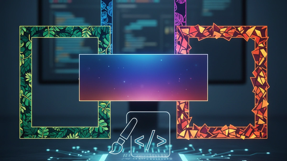
Borders in web design are key elements that can add a special touch to your site. In this article, we will explore how to create custom borders with CSS using images, gradients, and shapes. You will learn various techniques that will allow you to enhance the aesthetics of your web projects.
Introduction to CSS Borders
CSS (Cascading Style Sheets) allows you to customize the visual design of HTML elements on a web page. Borders are a crucial part of the design that defines the outline of an element. Incorporating custom borders can make your content stand out and provide users with a richer visual experience.
Types of Borders in CSS
Borders can be classified into several categories:
- Solid Borders: A basic border that applies a solid line around the element.
- Dotted and Dashed Borders: Borders that consist of alternating lines and spaces.
- Image Borders: Borders that use images to form their outline.
- Gradient Borders: Borders that feature a smooth color transition.
- Shape Borders: Borders in the form of curves or non-rectangular patterns.
Creating Custom Borders with Images
One of the most creative ways to customize borders is by using images. Here’s how to do it.
Read also
1. Using Images as Borders
You can use the border-image property to apply an image as a border. Here’s an example:
.box {
    border-width: 20px;
    border-style: solid;
    border-image-source: url('path/to/your/image.png');
    border-image-slice: 30;
    border-image-repeat: round;
}
Explanation of the Properties
- border-width: Defines the thickness of the border.
- border-style: Must be solid for the image to be applied.
- border-image-source: Defines the path to the image to be used.
- border-image-slice: Controls how the image is sliced.
- border-image-repeat: Defines how the image will be repeated along the border.
2. Practical Example of Borders with Images
<div class="box">
    This is an example of a custom border with an image.
</div>.box {
    border-width: 20px;
    border-style: solid;
    border-image-source: url('https://example.com/border.png');
    border-image-slice: 30;
    border-image-repeat: stretch;
    padding: 20px;
    text-align: center;
}
Creating Borders with Gradients
Gradient borders are another attractive option to enrich the design of your elements.
1. Using border-image with Gradients
You can create gradient borders using the border-image property along with the linear-gradient function. A basic example is as follows:
.box {
    border-width: 5px;
    border-style: solid;
    border-image-source: linear-gradient(to right, #ff7e5f, #feb47b);
    border-image-slice: 1;
    padding: 20px;
}
2. Example of Borders with Gradients
<div class="box">
    This is an example of a border with a gradient.
</div>.box {
    border-width: 5px;
    border-style: solid;
    border-image-source: linear-gradient(45deg, #FF5733, #C70039);
    border-image-slice: 1;
    padding: 20px;
    text-align: center;
}
Custom Borders with Shapes
If you want to go beyond rectangular borders, you can create borders with shapes using properties like border-radius.
1. Rounded Borders
.box {
    border: 5px solid #3498db;
    border-radius: 15px;
    padding: 20px;
}
2. Example of Borders with Shapes
<div class="box">
    This is an example of a rounded border in CSS.
</div>.box {
    border: 5px solid #9b59b6;
    border-radius: 25px;
    padding: 20px;
    text-align: center;
}
3. Oval-Shaped Borders
.box {
    width: 300px;
    height: 150px;
    border: 5px solid #2ecc71;
    border-radius: 75px;
    padding: 20px;
    text-align: center;
}
Conclusion
Custom borders are an excellent way to enhance your designs in CSS. Whether using images, gradients, or shapes, these elements can transform the appearance of your website and improve user experience. Experiment with different styles and properties to find the combinations that best suit your project.
Always remember to optimize your images and check CSS compatibility across different browsers to ensure a consistent experience on all devices. Happy designing!


